To make space smaller Swiper slider when viewing on smartphone.
Swiperのスライダーを利用したときにスマホ(縦)表示で余分なスペースを解消。
Too much of space like below.
以下のようにスライダーの上下にスペースが。。。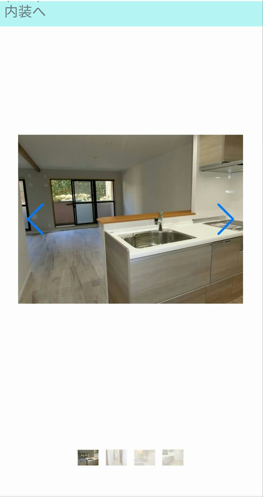
There is a solution to make like this.
こんな感じに解決できます。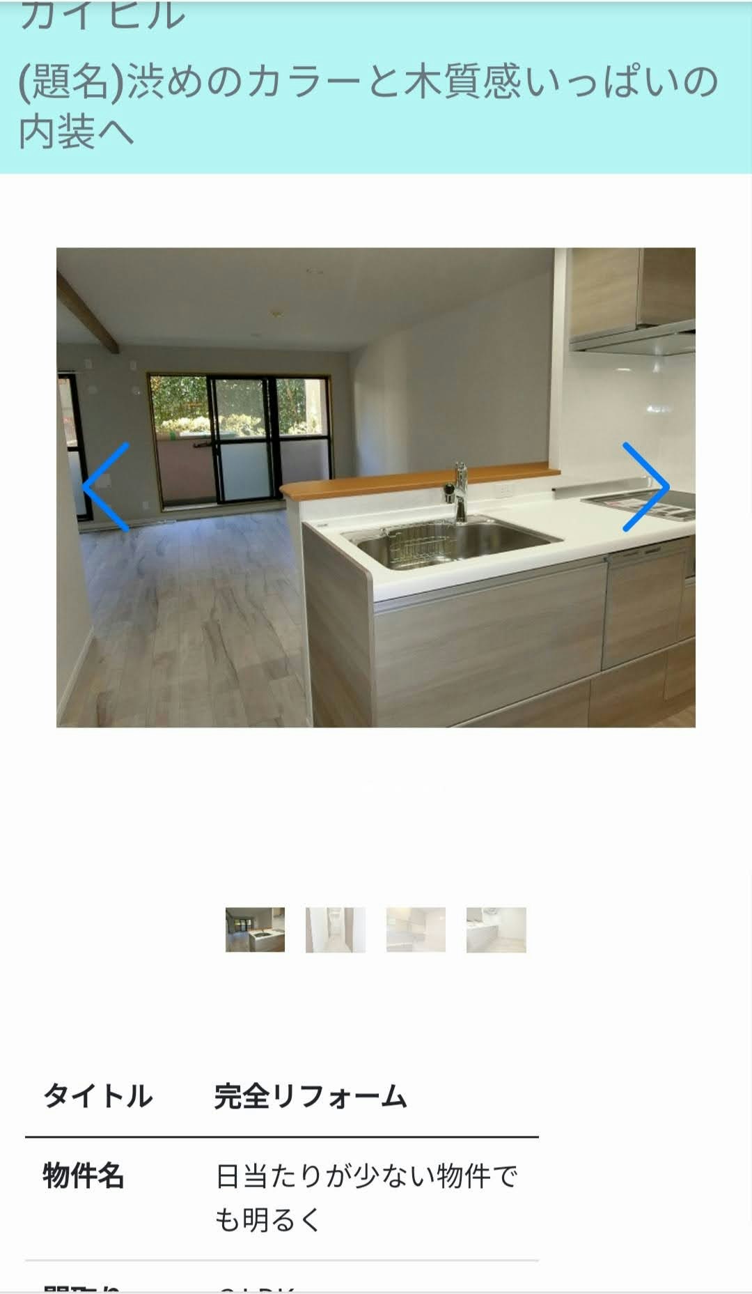
The problem is this CSS code. you can just change this code to like below.
このコードだけではレスポンシブに対応できないので下に書いたスマホとPCでの表示を変えるコードにします。
css
.gallery-top{height: 85%;width: 85%;}Replace the code above with this code.
以下のコードに書き換えます。
css
@mediascreenand(min-width: 751px){.gallery-top{height: 85%;width: 85%;}}@mediascreenand(max-width: 750px){.gallery-top{max-height: 85%;width: 85%;}}