CSSについて改めてドキュメントを読んでみて、今更「疑似クラス」なるもの存在を知る。
スクリプトを書かなくても似たような実装がCSSだけで出来る模様なので、用途毎に整理。
目次を見て、探してる用途に合った内容があれば、コピペして使えばいいのかなぁと。
ブラウザは、Chrome・FireFox・InternetExplorer・Edge・safariに対応している内容のみを書きました。
調べてみると「InternetExplorer」「FireFox」未対応の「疑似クラス」が多い。。
ブラウザ依存が無ければ、もっと色々できるみたいなんだけど・・。
参考
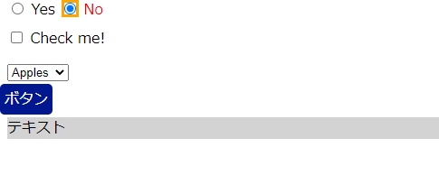
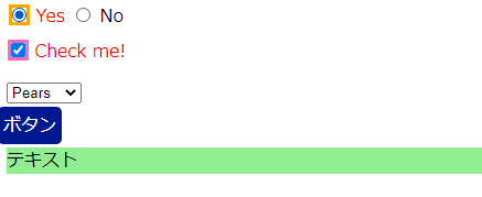
オプションボタン・ラジオボタン・チェックボックス・チェックON時に発火
チェック用ボックスとかを非表示(display:none)にして、ボタンとか要素クリック的な使い方もできそう?
※色の切り替えや要素の表示・非表示程度だろうけども・・。
sample.html
<div><inputtype="radio"name="my-input"id="yes"><labelfor="yes">Yes</label><inputtype="radio"name="my-input"id="no"><labelfor="no">No</label></div><div><inputtype="checkbox"name="my-checkbox"id="opt-in"><labelfor="opt-in">Check me!</label></div><selectname="my-select"id="fruit"><optionvalue="opt1">Apples</option><optionvalue="opt2">Grapes</option><optionvalue="opt3">Pears</option></select><br/><labelfor="toggle"style="cursor: pointer;background:#00188f; color:#fff; padding:5px;
    border-radius:5px;">ボタン風ラベル</label><inputtype="checkbox"id="toggle"style="display: none;"><divclass="clicksample">テキスト
  </div>
sample.css
div,select{margin:8px;}/* チェックが入った入力のラベル */input:checked+label{color:red;}/* チェックが入ったラジオボタン */input[type="radio"]:checked{box-shadow:0003pxorange;}/* チェックが入ったチェックボックス */input[type="checkbox"]:checked{box-shadow:0003pxhotpink;}/* 選択されたオプション */option:checked{box-shadow:0003pxlime;color:red;}/* 「テキスト」 */.clicksample{background:lightgray;}/* ボタン風ラベルクリック時 */#toggle:checked+.clicksample{background:lightgreen;}結果
disabled状態の場合
たまに「disabled」の色を変えたいって、お客様いますよね。
sample.html
<formaction="#"><fieldsetid="shipping"><legend>送り先</legend><inputtype="text"placeholder="名前"><inputtype="text"placeholder="住所"><inputtype="text"placeholder="郵便番号"></fieldset><br><fieldsetid="billing"><legend>請求先</legend><labelfor="billing_is_shipping">送り先と同じ:</label><inputtype="checkbox"id="billing-checkbox"checked><br><inputtype="text"placeholder="名前"disabled><inputtype="text"placeholder="住所"disabled><inputtype="text"placeholder="郵便番号"disabled></fieldset></form>sample.css
input[type="text"]:disabled{background:#ccc;}sample.js
// ページの読み込みの終了を待つdocument.addEventListener('DOMContentLoaded',function(){// チェックボックスに 'change' イベントリスナーを追加document.getElementById('billing-checkbox').onchange=toggleBilling;},false);functiontoggleBilling(){// 請求先のテキストフィールドを選択varbillingItems=document.querySelectorAll('#billing input[type="text"]');// 請求先テキストフィールドを切り替えfor(vari=0;i<billingItems.length;i++){billingItems[i].disabled=!billingItems[i].disabled;}}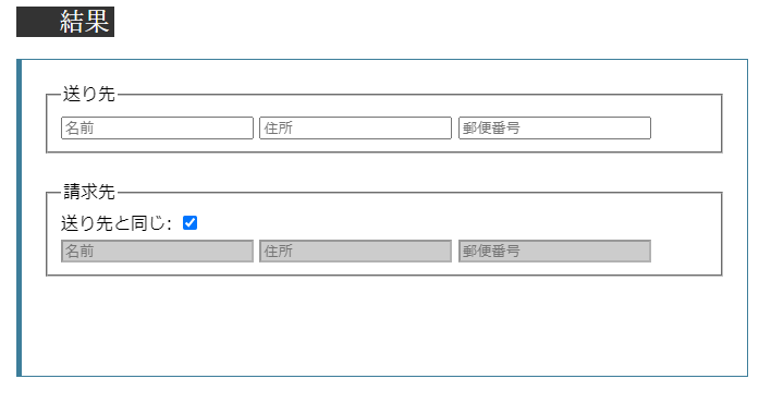
enabled状態の場合
「disabled」もあるので、「enabled」ものせておきます。
sample.html
<formaction="url_of_form"><labelfor="FirstField">First field (enabled):</label><inputtype="text"id="FirstField"value="Lorem"><br><labelfor="SecondField">Second field (disabled):</label><inputtype="text"id="SecondField"value="Ipsum"disabled="disabled"><br><inputtype="button"value="Submit"></form>sample.css
input:enabled{color:#2b2;}input:disabled{color:#aaa;}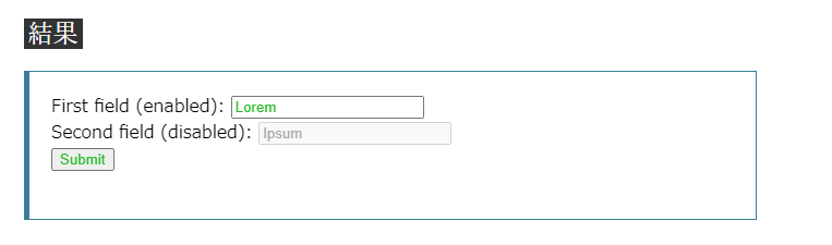
フォーカス時
こちらは、業務アプリ系だとよくやっていますね。
sample.html
<inputclass="red-input"value="I'll be red when focused."><br><inputclass="blue-input"value="I'll be blue when focused.">sample.css
.red-input:focus{background:yellow;color:red;}.blue-input:focus{background:yellow;color:blue;}結果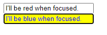
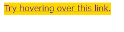
ホーバー(hover)時
これは、要望あるかな・・?ありそうで無さそうな。
sample.html
<ahref="#">Try hovering over this link.</a>sample.css
a{background-color:powderblue;transition:background-color.5s;}a:hover{background-color:gold;}結果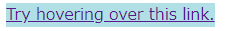
リンク(aタグ)の状態に応じて、スタイルを変える。
こちらは、あまり要望ないかも・・?
sample.html
<p>この段落にはリンクが含まれています。
  <ahref="#">このリンクはクリックすると赤色になります。</a>この段落は段落やリンクをクリックすると灰色になります。
</p>
sample.css
a:link{color:blue;}/* 未訪問リンク */a:visited{color:purple;}/* 訪問済みリンク */a:hover{background:yellow;}/* ホバー時 */a:active{color:red;}/* アクティブなリンク */p:active{background:#eee;}/* アクティブな段落 */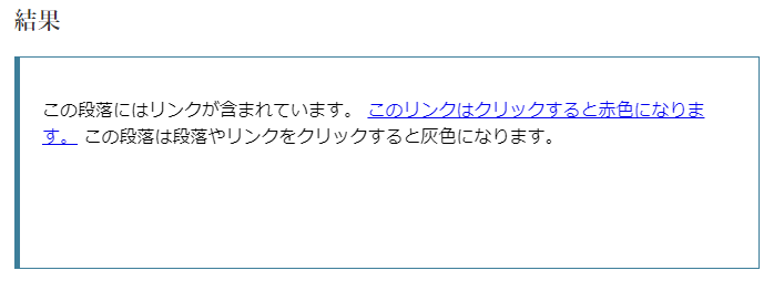
否定(not)文?
たまにスクリプトのセレクタでも使います。
一つ一つ、classとかの適用がめんどいときに使える?
sample.html
<p>I am a paragraph.</p><pclass="fancy">I am so very fancy!</p><div>I am NOT a paragraph.</div>sample.css
.fancy{text-shadow:2px2px3pxgold;}/* <p> elements that are not in the class `.fancy` */p:not(.fancy){color:green;}/* Elements that are not <p> elements */body:not(p){text-decoration:underline;}/* Elements that are not <div> and not <span> elements */body:not(div):not(span){font-weight:bold;}/* Elements that are not `.crazy` or `.fancy` *//* Note that this syntax is not well supported yet. */body:not(.crazy,.fancy){font-family:sans-serif;}
要素の位置を指定する場合
縞模様とかで一覧系だとよく使いそう。
sample.html
<h3><code>span:nth-child(2n+1)</code>, WITHOUT an
<code><em></code> among the child elements.</h3><p>Children 1, 3, 5, and 7 are selected.</p><divclass="first"><span>Span 1!</span><span>Span 2</span><span>Span 3!</span><span>Span 4</span><span>Span 5!</span><span>Span 6</span><span>Span 7!</span></div><br><h3><code>span:nth-child(2n+1)</code>, WITH an
<code><em></code> among the child elements.</h3><p>Children 1, 5, and 7 are selected.<br>
3 is used in the counting because it is a child, but it isn't
selected because it isn't a <code><span></code>.</p><divclass="second"><span>Span!</span><span>Span</span><em>This is an `em`.</em><span>Span</span><span>Span!</span><span>Span</span><span>Span!</span><span>Span</span></div><br><h3><code>span:nth-of-type(2n+1)</code>, WITH an
<code><em></code> among the child elements.</h3><p>Children 1, 4, 6, and 8 are selected.<br>
3 isn't used in the counting or selected because it is an <code><em></code>,
not a <code><span></code>, and <code>nth-of-type</code> only selects
children of that type. The <code><em></code> is completely skipped
over and ignored.</p><divclass="third"><span>Span!</span><span>Span</span><em>This is an `em`.</em><span>Span!</span><span>Span</span><span>Span!</span><span>Span</span><span>Span!</span></div>sample.css
html{font-family:sans-serif;}span,divem{padding:5px;border:1pxsolidgreen;display:inline-block;margin-bottom:3px;}.firstspan:nth-child(2n+1),.secondspan:nth-child(2n+1),.thirdspan:nth-of-type(2n+1){background-color:lime;}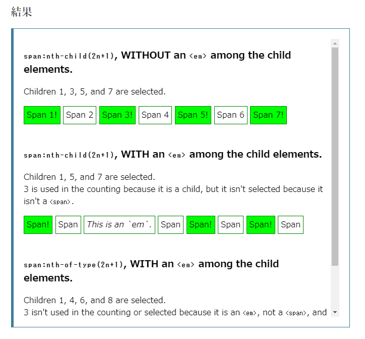
プレースホルダー表示中の間だけスタイルを適用
たまに要望があるかも・・?
sample.html
<inputplaceholder="何か入力してください!">sample.css
input{border:2pxsolidblack;padding:3px;}input:placeholder-shown{border-color:red;}結果
未入力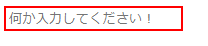
入力済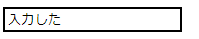
とまぁ書いておきながら、結局全部スクリプトで書いちゃえ!って、思ってしまいそうではある。。