どうも7noteです。立方体の作り方
サイコロを作ったり、写真をはめ込んだ立方体を作ったりすることができます。
作ったことがなかったので、作り方を調べたので記録代わりに投稿。
使い方をマスターすればいろいろなものが作れそう。
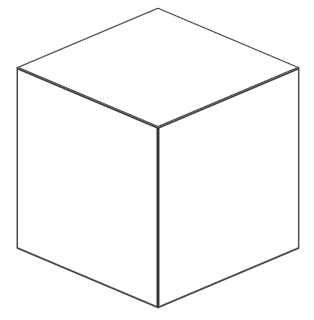
①線のみVer.
index.html
<divclass="box"><divclass="item"></div><divclass="item"></div><divclass="item"></div></div>style.css
.box{display:block;position:relative;margin:30pxauto0;width:100px;height:100px;transform-style:preserve-3d;transform:rotateX(-25deg)rotateY(-45deg);/* ここで四角の角度を調整できる */}.box.item{position:absolute;left:0;right:0;box-sizing:border-box;border:1pxsolid#333;width:100%;height:100%;}/* 上 */.box.item:nth-child(1){transform:translate3d(0,-50px,0)rotateX(-90deg);}/* 左 */.box.item:nth-child(2){transform:translate3d(0,0,50px);}/* 右 */.box.item:nth-child(3){transform:translate3d(50px,0,0)rotateY(90deg);}②色付きVer.
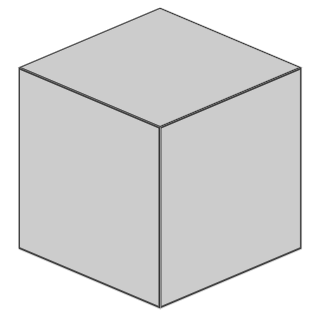
style.css
/* ①に↓を追記 */.box{background:#ccc;}※各面で違う色や背景画像を指定することも可。
その場合は各nth-child()の指定があるところにbackgroundを指定。
③文字入りVer.
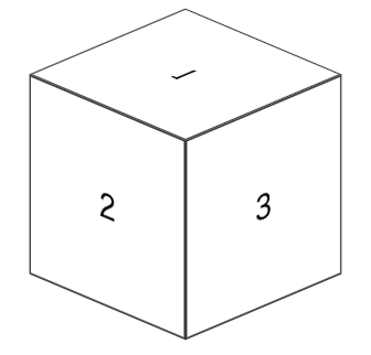
index.html
<divclass="box"><divclass="item">1</div><divclass="item">2</div><divclass="item">3</div></div>style.css
/* ①に↓を追記 */.box{display:flex;flex-direction:row;align-items:center;justify-content:center;}④サイコロVer.
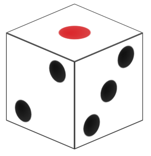
style.css
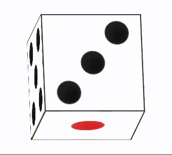
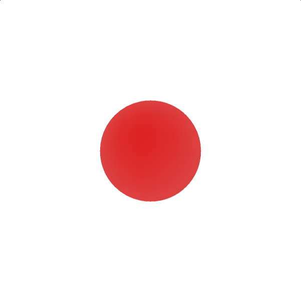
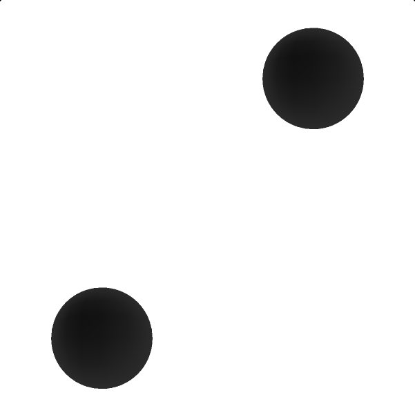
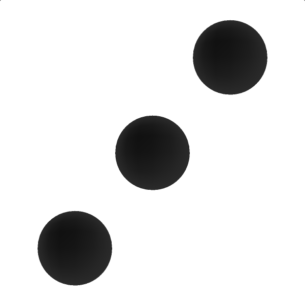
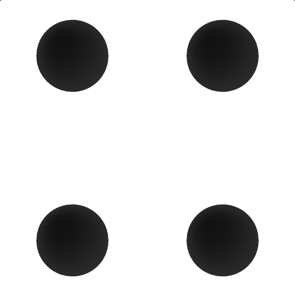
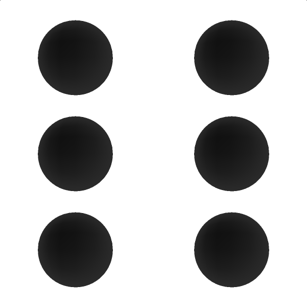
/* 画像を用意して①に↓を追記 *//* 上 */.box.item:nth-child(1){background:url(sai1.png)no-repeatcentercenter/100%100%;}/* 左 */.box.item:nth-child(2){background:url(sai2.png)no-repeatcentercenter/100%100%;}/* 右 */.box.item:nth-child(3){background:url(sai3.png)no-repeatcentercenter/100%100%;}※画像は一番下にあります。
⑤サイコロ アニメーションVer.
index.html
<divclass="dice"><divclass="item"></div><divclass="item"></div><divclass="item"></div><divclass="item"></div><divclass="item"></div><divclass="item"></div></div>style.css
.dice{display:block;position:relative;margin:30pxauto0;width:100px;height:100px;transform-style:preserve-3d;transform:rotateX(360deg)rotateY(360deg)rotateZ(720deg);animation:rotate-animation2slinearinfinite;}.dice.item{position:absolute;left:0;right:0;border:1pxsolid#333;box-sizing:border-box;width:100%;height:100%;}/* 1 */.dice.item:nth-child(1){transform:translate3d(0,-50px,0)rotateX(-90deg);background:url(sai1.png)no-repeatcentercenter/100%100%;}/* 2 */.dice.item:nth-child(2){transform:translate3d(0,0,50px);background:url(sai2.png)no-repeatcentercenter/100%100%;}/* 3 */.dice.item:nth-child(3){transform:translate3d(50px,0,0)rotateY(90deg);background:url(sai3.png)no-repeatcentercenter/100%100%;}/* 4 */.dice.item:nth-child(4){transform:translate3d(-50px,0,0)rotateY(-90deg);background:url(sai4.png)no-repeatcentercenter/100%100%;}/* 5 */.dice.item:nth-child(5){transform:translate3d(0,0,-50px)rotateY(180deg);background:url(sai5.png)no-repeatcentercenter/100%100%;}/* 6 */.dice.item:nth-child(6){transform:translate3d(0,50px,0)rotateX(-90deg);background:url(sai6.png)no-repeatcentercenter/100%100%;}@keyframesrotate-animation{from{transform:rotate3d(0);}to{transform:rotate3d(1,1,1,-360deg);}}感想
.2sくらいで超高速でアニメーションさせたら、桃鉄のサイコロ振る時みたいにできるよ。

あ〜〜桃鉄やりたい。
参考・素材
https://shanabrian.com/web/css3/transform-cube-dice.php
https://chicodeza.com/freeitems/saikoro-illust.html

おそまつ!
~ Qiitaで毎日投稿中!! ~
【初心者向け】HTML・CSSのちょいテク詰め合わせ